Categories
How do you do research? Visual working

Documenting your user research well

For some time I have wanted to write about documenting research. Whew, you’re thinking now, never mind, that’s not a sexy topic. Important though, so in this blog I show very specifically how to properly capture research results. I work for the public service as a civil servant, so I might as well give away my secrets 🙂

Earlier I wrote about why good documentation is important. If you want to work openly, getting your documentation right is a must. At the Executive Agency of Education, where I work, it comes up every year in our good research intentions. And it’s important if you want to make decisions as an organization not on gut feelings, but based on an understanding of your user.

What is good documentation?

The same rules apply to recording your research as to any information. It should be:

  • accessible: anyone in your organization can access it (and if you work openly, anyone outside)
  • findable: the insights are searchable and the information reaches the right people
  • understandable: enough context for every reader, even if you are new to the team
  • actionable: clear conclusions and recommendations that you can deploy and they are well substantiated

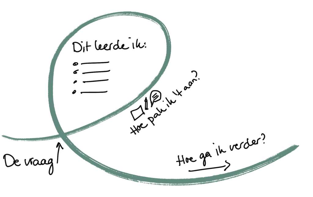
Most research at organizations goes hand in hand with development or policy teams who then work on it. That means working in short iterations. The easiest way is to document each step directly. Your research file will naturally grow with you. I do that in 4 steps:

  1. I begin with the research question. This is also usually the reason for the research.
  2. I write and show how I handled it. What is the method, who were involved?
  3. What did I learn? Based on what?
  4. How do I proceed?

It works best when all the research is together and not scattered among departmental disks. Different teams sometimes work for the same user. Standing all together, they can easily use each other’s insights. And when something contradicts a previous study, you can see that. This is how you learn as an organization (without endless meetings, hehe!). I wrote this blog about it earlier: Everything we know about the customer, we all know.

From audio to drafts to blog to essay

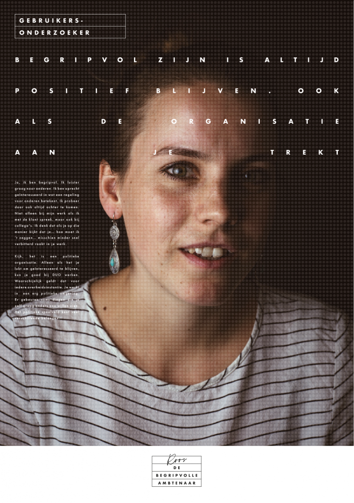
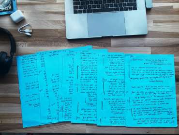
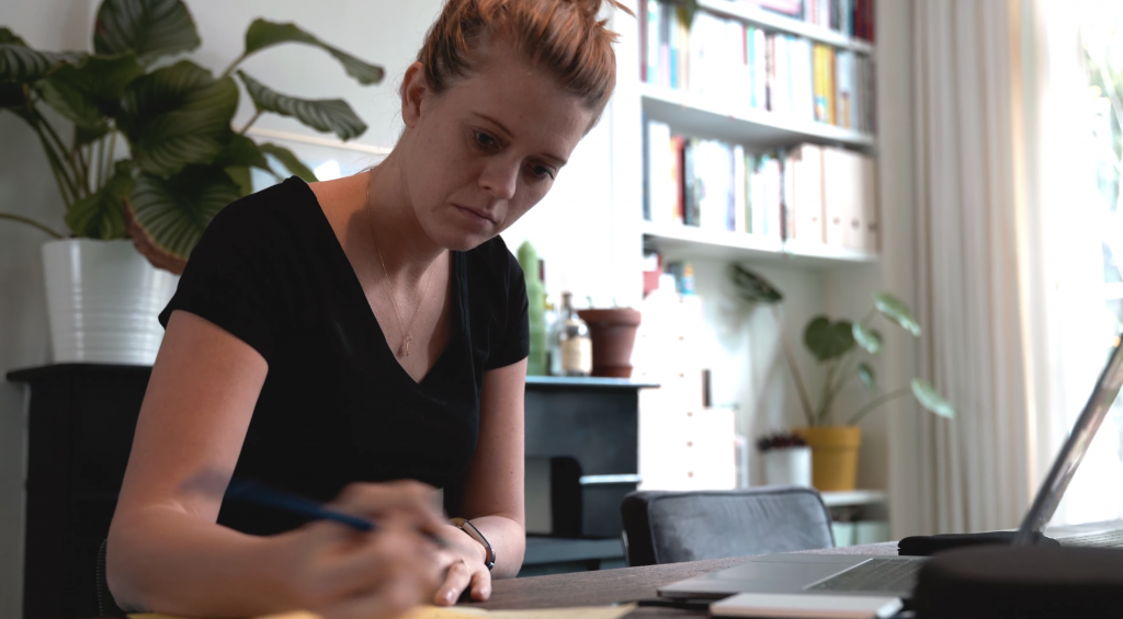
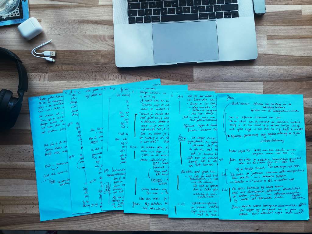
An example. For the portrait series The Compassionate Civil Servant, I also tackled it this way. I began with an interview. I recorded that in audio and photographs. Later I listened back to everything and sometimes wrote 10 A4 sheets of paper. I also used Happyscribe for this on occasion, but writing on paper works nicer for me. In my draft, I marked the main points I learned. I looked for any additional context to that (desk research). I summarized everything in a blog with recommendations for myself on how to proceed in the research. After 17 interviews, I summarized all the insights in essays on The Compassionate Civil Servant.

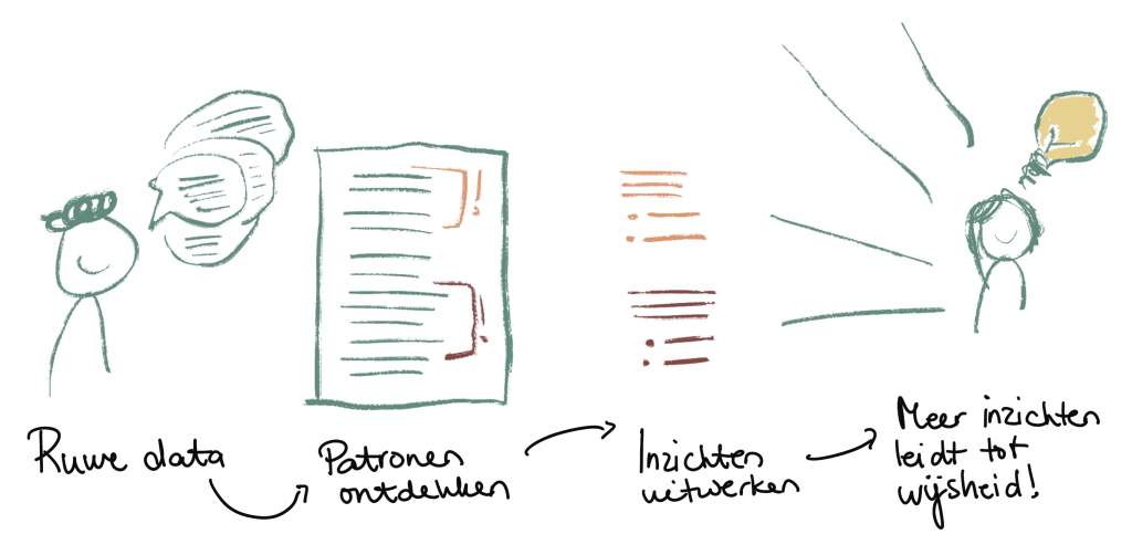
From raw data to wisdom

When I document a research moment, I not only tell what I discovered, I show it. I provide examples and substantiate conclusions with quotes, in text or audio, and visuals.

You should not believe it because I write something, but for the evidence that comes with it.

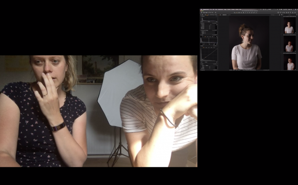
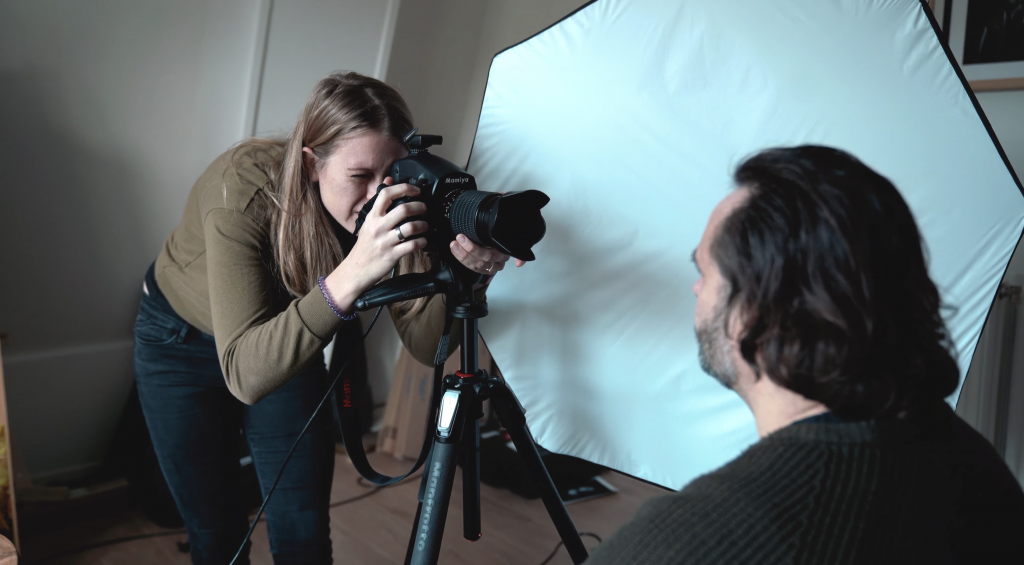
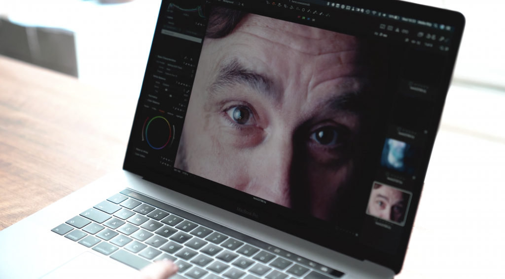
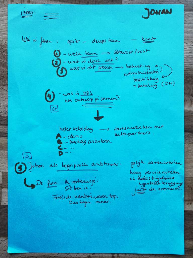
In my interview with Henk as a compassionate civil servant, this process looked like this (from the “behind-the-scenes” video made by Aljan Scholtens):

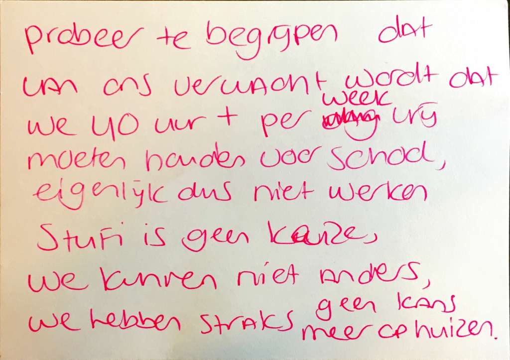
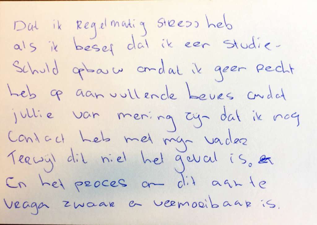
From Henk I no longer have my drafts, but from Johan I still do. Especially for you here they are on the blog.

Another example: CoronaMelder

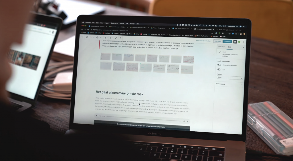
Over the summer, I walked along with staff from the Public Health Service in their work to fight the coronavirus. I was not allowed to make recordings, so I typed along live with every conversation. On my laptop, I made folders with a document per visit, or sometimes per person I spoke to.

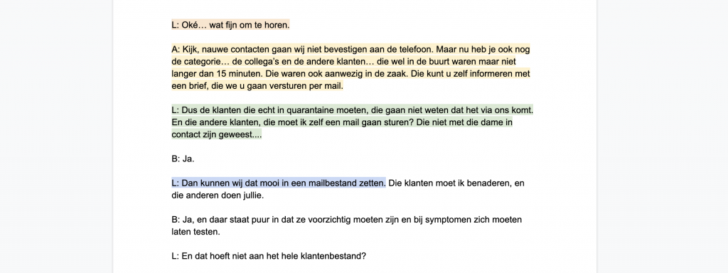
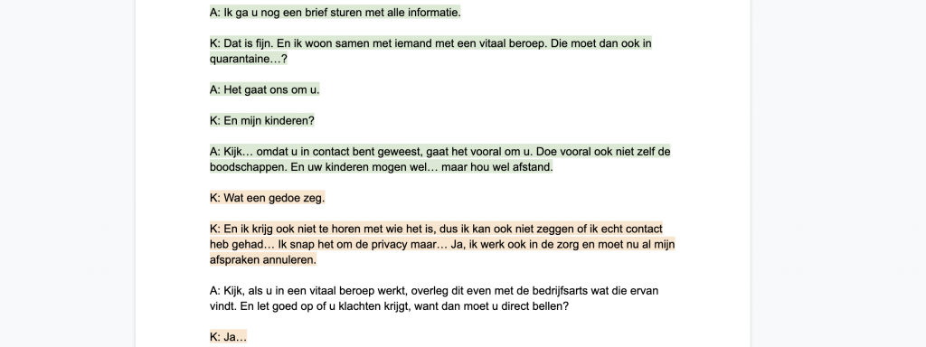
After the visit, I went through that again. First to correct all the typos of fast typing. Then to discover patterns that I underlined. Different subjects I gave their own color. For each topic, I worked it into an insight. We shared those insights, along with the context of the research and the observations on which it was based, on Github.

What themes were the interviews about? What did I see while walking along? How did employees work with all the systems and with each other? Did something come back regularly, how?

When listening in with a source and contact tracer, for example, it looked like this. Green highlighted is about how the Covid measures are told, orange how people respond to them, yellow how contacts are mapped and blue is about the systems used. We found green and orange information especially important when designing the notification CoronaMelder sends via your phone. For comparison, here is the documented research from that day.

It’s not just about what people say, but what you see, what people do and what happens around you during a research moment. In one of my first visits, several employees told me that they have to work differently all the time. “At every press conference another change is announced and we have to do our work differently.” In the corridors I saw flip charts always showing the new approach, the old sheets lying on the floor in the corner. This follow-along day then led to this insight“The process changes every week.

In all this documentation, you can see exactly how I go from“what did I see” to“what do I know now” to“next step. At CoronaMelder, all research and insights are published on Github, and searchable in Sticktail (the program the researchers work in). That way, the whole research file is together and our wisdom as a team and as an organization grows “naturally” as we do more research.

What to record and what not to record

Of course, there are limits to what information you keep, how you do it and for how long. Consider the following

  • information about individuals. Of course you ask permission for the research, but you usually don’t have to tell in your documentation exactly who it’s about. Sometimes video footage is fine, do ask extra permission for this if you want to share it. (I usually send it too: ‘look, this is how I used it in the report’).
  • information that is irrelevant or outdated.
  • information that should not be shared. This is especially important if you work in the open. Where is the cut and what should not “go out”? Consult on this and discuss who determines this and on what terms.

And make sure your information is easy to find. I use categories and tags on this blog. At the Executive Agency of Education, like at CoronaMelder, we work with Sticktail which also makes tag-based searching in all your research easy. Give documents and folders good names that everyone can understand (not just you). That way you never lose track.

Documenting will never be completely sexy, but hopefully this will get you a long way. Good luck!

Categories
Not part of a category

More color

In the end of November is the User Central conference and I am hosting it this year. This week I spoke to one of the speakers and she told me that she did not want to be at an all-white conference. She did have some names of good speakers of color that we could invite, possibly instead of her if there was no more room in the program.

In this blog my thoughts about, from where I can see, there are few designers of color working in the Dutch government and why that is a problem.

A very white frame

A month before my interview with the speaker in question, I was looking for great speakers to shortlist. I obviously wanted a lot of good women who really have something to say, after all, there are quite a lot of them. Of course some men, but no pancakes please, they too should really have something to report. I looked proudly at my list which secretly had more women on it than men, gna gna. You get it, I’m well sick of these all-male conferences.

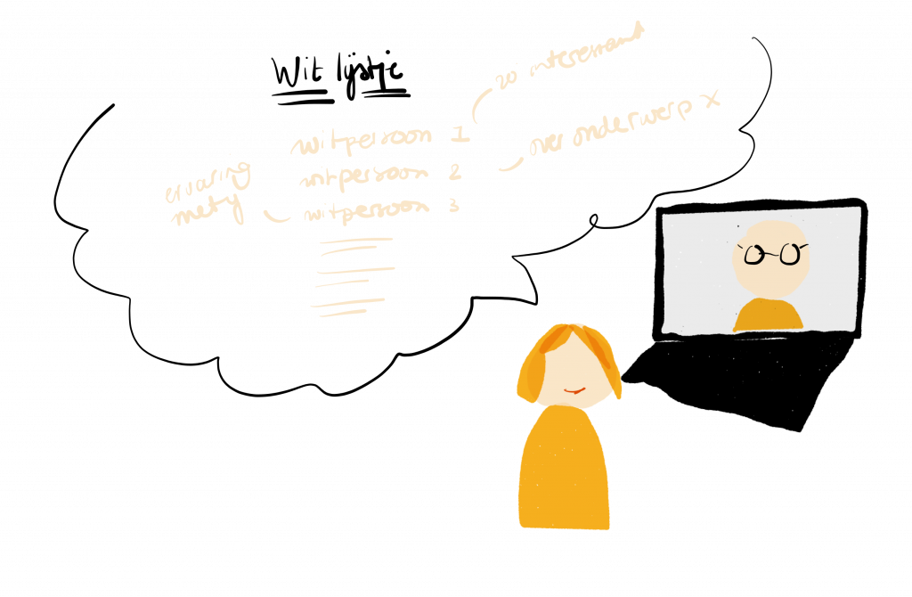
Only, my list was very white. That bugged me. I searched on, but wasn’t really sure how. If you search for designers or anything with “design thinking” in combination with “government” on LinkedIn you will scroll through lists of white people. In my own network (and it is not small) there are also mostly a lot of white people. Asking out loud on Twitter for tips, I felt quite a bit of trepidation there. How do I formulate that question?

After the video call, I lingered on the call with co-organizer Robert. We both wanted things to be different. Of course we were going to ask someone from her list, but the following days it stayed in my head. Why do I know so few designers of color in the Netherlands? I’m sure there are, there must be.

“How do you start?” I asked Robert. “Do I just pop on Twitter: ‘hello, designers of color, where are you?” “Yeah, maybe that’s the beginning.”

Design in government is too white and that’s a problem

The core of design thinking is that you start with people. The human perspective is leading, and then you align organizational and technical interests. The government is there for everyone, or at least it should be. That also means for people who are not white. In my opinion, white people are by far the majority in government. They look at me from their LinkedIn profiles and from the pictures that accompany government vacancies and are highlighted on Twitter. They are on the stages of government conferences, and even my portrait series The Compassionate Civil Servant is a gallery of white people.

In my research into what role understanding has in digital government, I discovered that technology is not neutral. The white creators of digital government unknowingly put pieces of themselves into what they create. Pieces about how they see the world, what is good or bad behavior and how laws are interpreted. It is people work that is currently done mostly by white people. Technology reflects our cultural and political values. I wrote the essay “Empathy in Government” about this.

If white is the norm, and you are the norm, it’s hard to notice how people who are not that norm perceive your digital services. There are so many advantages to having a more diverse team. To have more perspectives and not blindly follow the norm that is not normal for everyone.

In 2017, I conducted research on integrating in the Netherlands. I am from Suriname and moved to the Netherlands when I was 14. My own homesickness came back during the study. The mix of emotions I felt when I had to “Dutchify” I recognized in the refugees with whom I did research. My research became richer. Our conversations went into more depth about cultural differences, what it’s actually like to move from country to country and how that affects the integration process. My background actually helped to do this research.

My colleague Ruth who has a Caribbean background herself did research last year on debt burdens in the Caribbean Netherlands. Precisely because of her background, she had a different starting point, spoke the same language, knew the right cultural differences and the research became better than if I, for example, had done it.

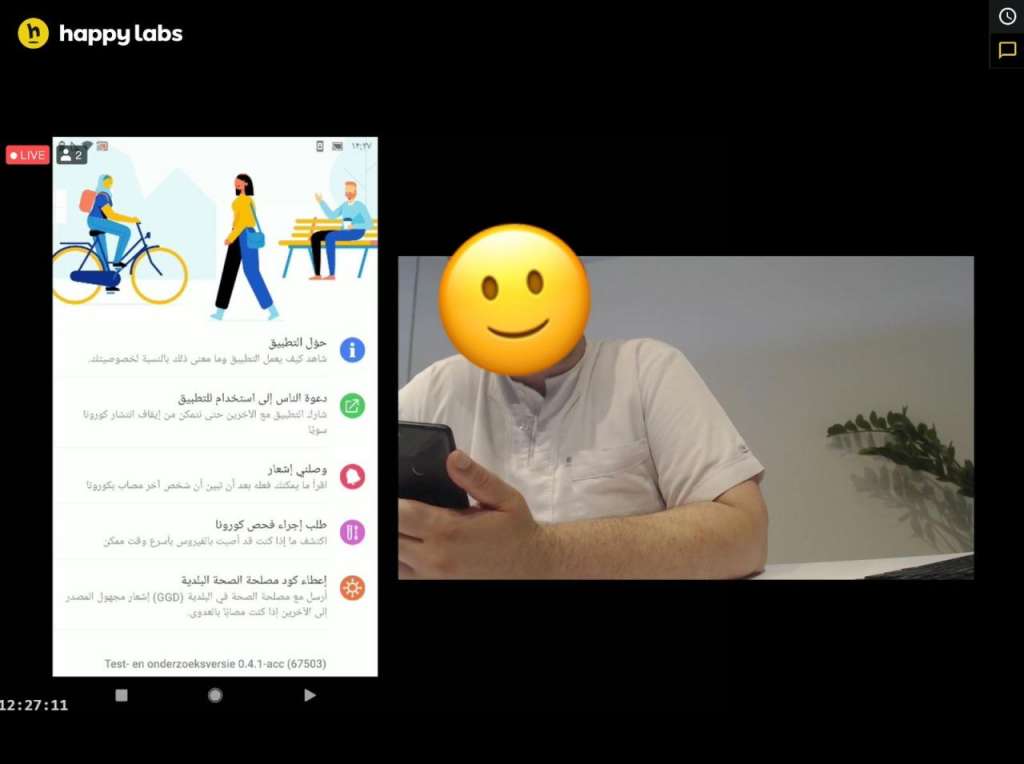
When we tested the Arabic version of the app for CoronaMelder, I felt awkward. I didn’t even know what to look for. The language, of course, but because Arabic is right-to-left it also changes the app’s user interface. On Twitter, I learned that just the readability of Arabic fonts alone could get you an evening of tweeting. You will only find this out if you work intensively with people of Arab background, even better if they are on your team.

Are we making enough of an effort?

When I asked colleagues if I could photograph them as compassionate civil servants, they were mostly white men. After the fifth photo, I couldn’t ignore it. “I should ask more women,” I thought. After the seventh photo, I looked at the prints hanging in my studio and thought “everyone is white, I don’t want that.” It sometimes gave me a stomach ache. Where I sometimes found it hard to find a woman in a department full of ict workers, I found it even harder to find someone of color. And, I ask that person then just because they are a woman, or because they are of color, or is it about the content job? I often struggled with these questions.

We can’t find them because they don’t seem to be there. And since they don’t seem to be there, we don’t include them.

‘But if you’re good, you’ll surface naturally, right?’ That’s not true.

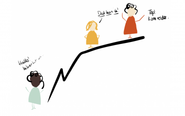
When I started as a government researcher 7 years ago, I didn’t come out on top because I was so good. No, I saw an opportunity, was bold and said I could do it. I had all the traffic lights with me. I was lucky. I knew the person who made the selection and I bluffed myself in. I was given the opportunity.

Then I threw myself into the subject matter like mad, read books, asked questions out loud, and started this blog to share what I learned. My colleague Ruth once told me that because she is black, she always feels like she has to work harder, prove more and can’t bluff without immediately falling through.

A lot of research has been done on this. If you are white, it is easier to “float to the top” than if you are black. Anousha Nzume’s book “Hello White People” is a great starting point if you want to learn more about this.

I would like myself to change this.

That’s why I think it would be fun to get to know designers of color, especially if you work in government. Send me a message on Twitter or an email to maike @ klipklaar. nl. Who are you, and how are you thinking about these things? And how can we change it together?