When you have been dealing with tough issues for a long time, it is sometimes difficult to find a breakthrough. It can seem like a problem just can’t be solved. These types of “wicked problems” are complex and constantly evolving. There are all sorts of parties involved that often have competing interests.
In government, we have enough of this kind of tough problems. In my research into how we can make government services that are good for people, I come across them regularly. I am currently researching how the government designs services for people in debt.
In my research, I look particularly at government organisations themselves. How do they learn and develop their own skills to better serve citizens? If you want to follow this research, subscribe to my monthly newsletter.
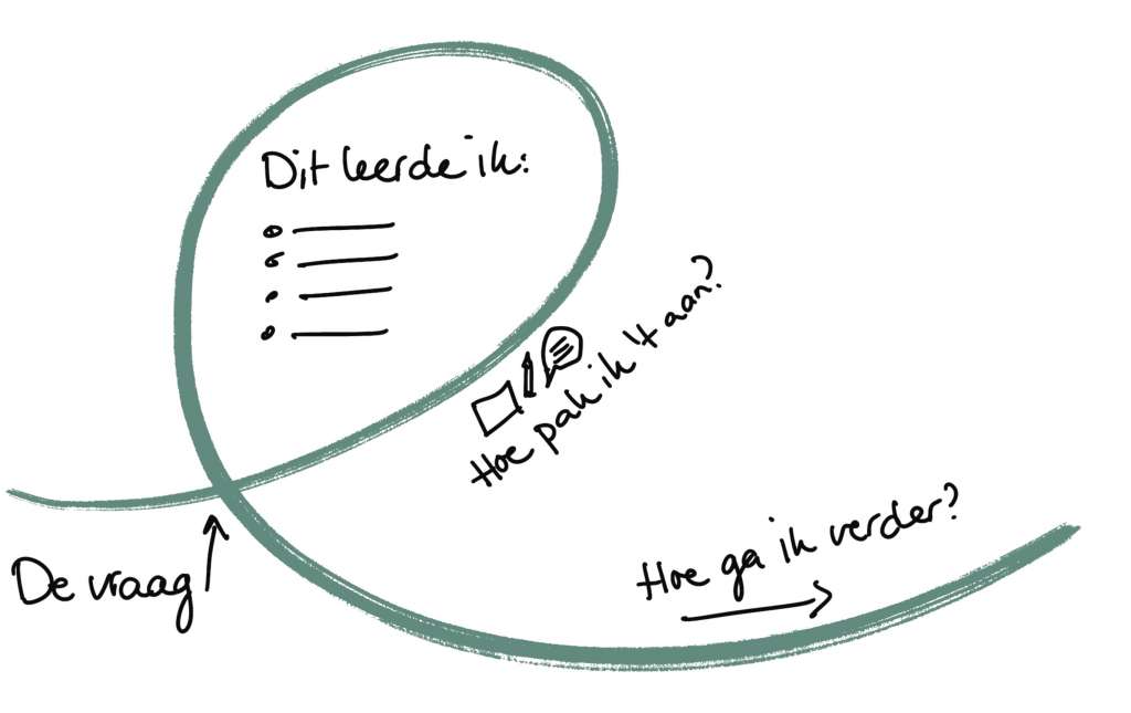
Kees Dorst, a professor in Sydney, wrote the first design book I read 8 years ago as a junior designer in government: Frame Innovation. He describes a number of steps you can take to see new solution directions for tough issues. You do this by thinking differently: by reframing the problem.
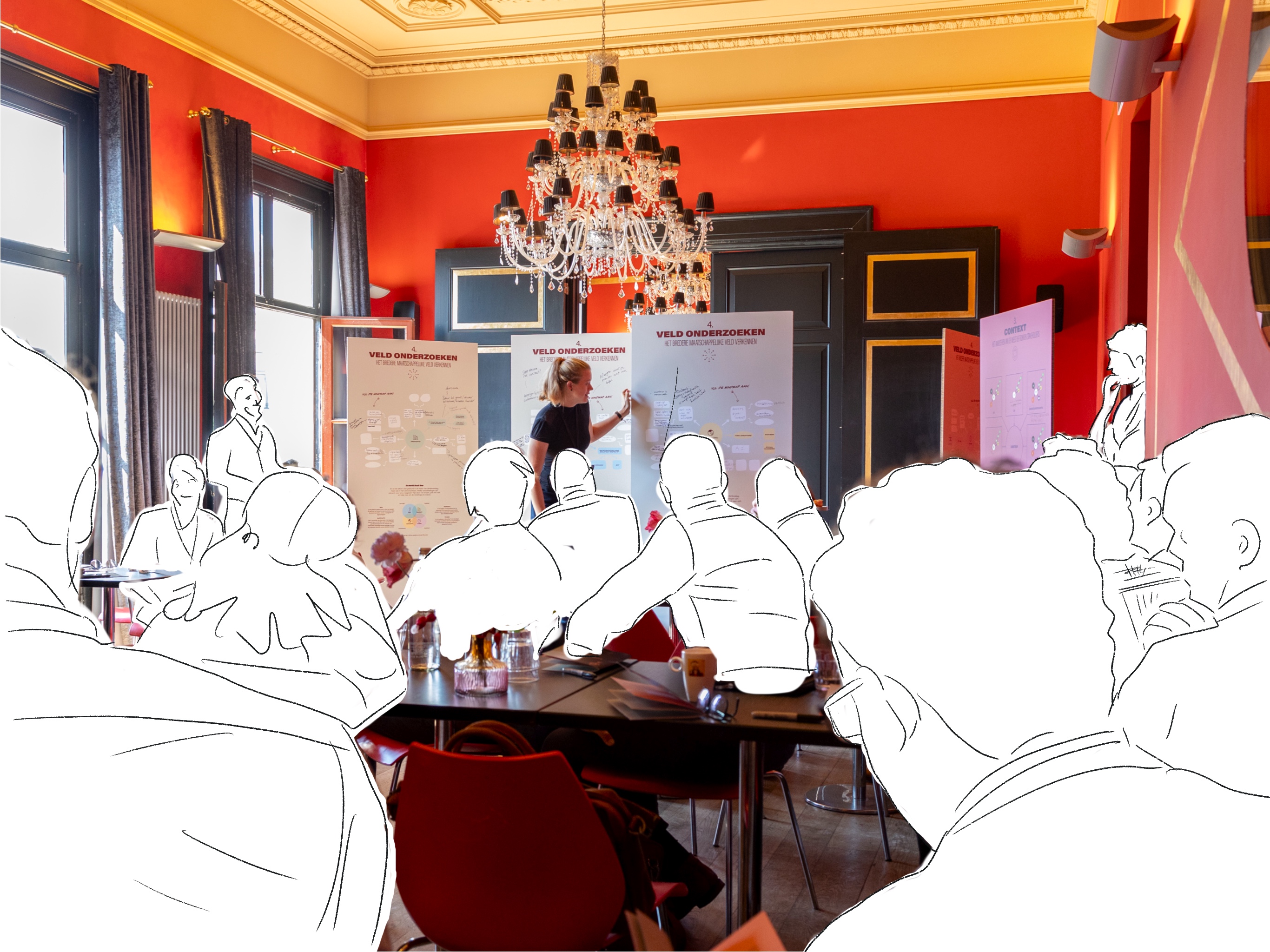
In this blog, you will read about how I am using this method with team members I am working with this year. The topic: how does the government seizure someone’s wages when they fail to pay a debt? This month we organized a collaboration day attended by about 40 people. We are still in the middle of the project, so this blog is a reflection on the approach in between. What do I learn about applying this design method in the government context?
The wicked problem
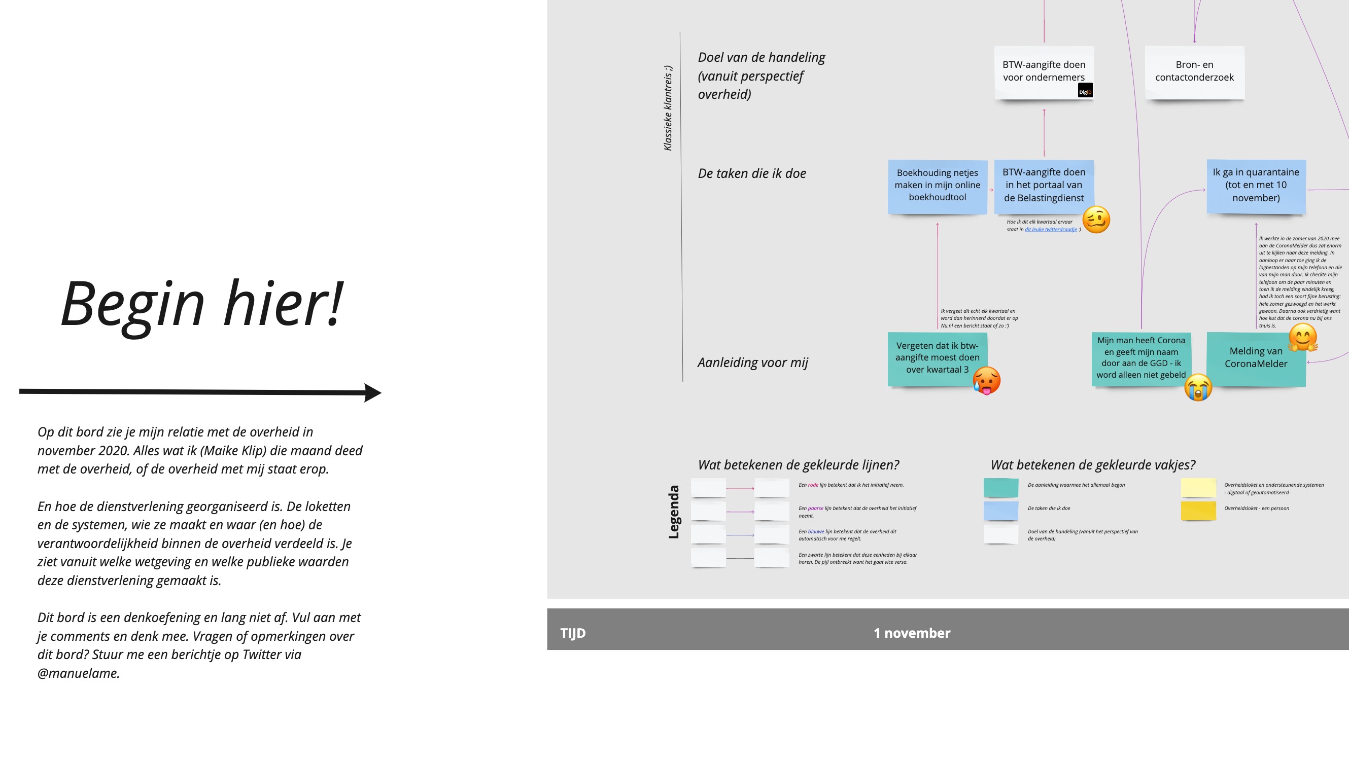
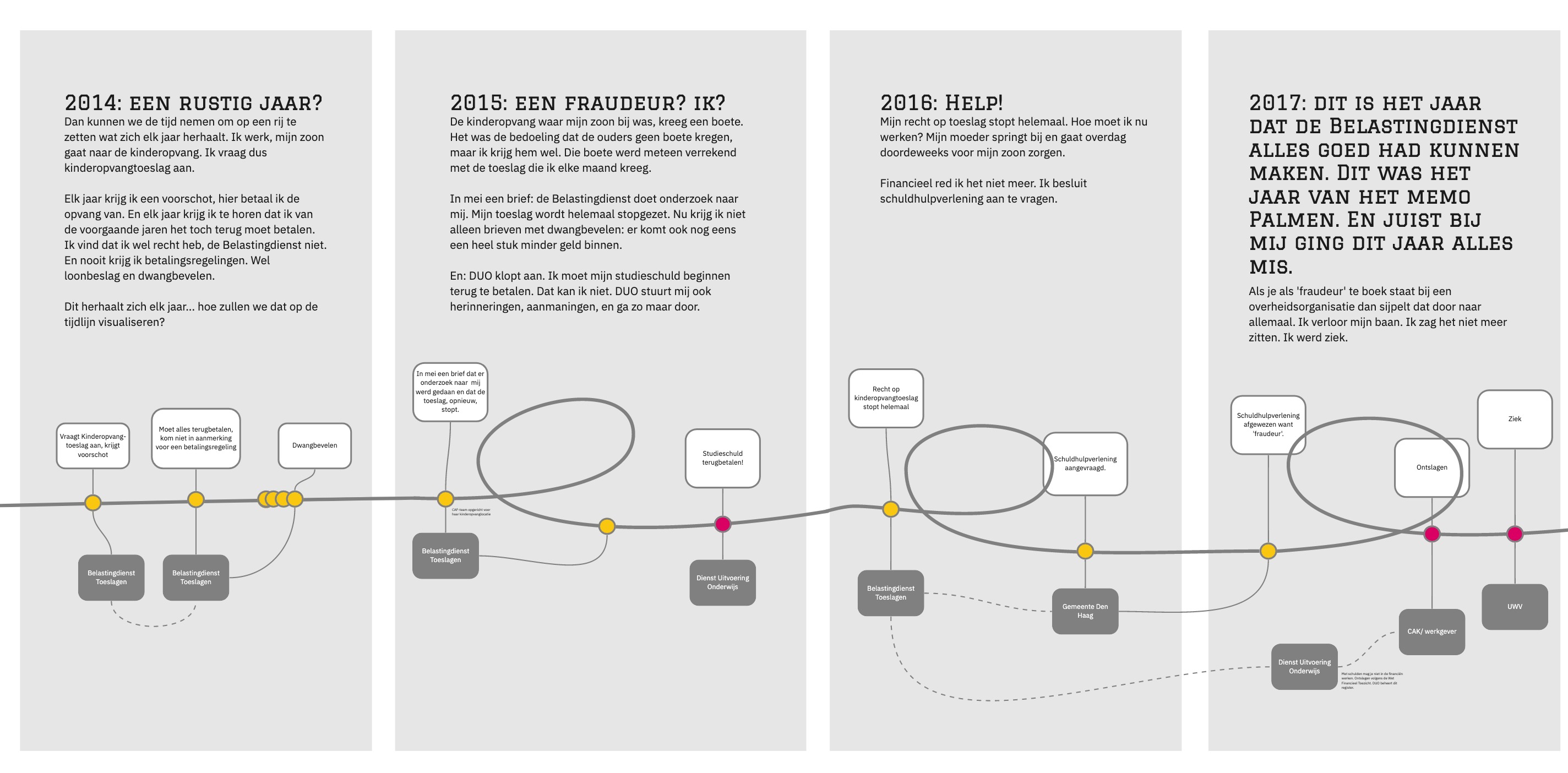
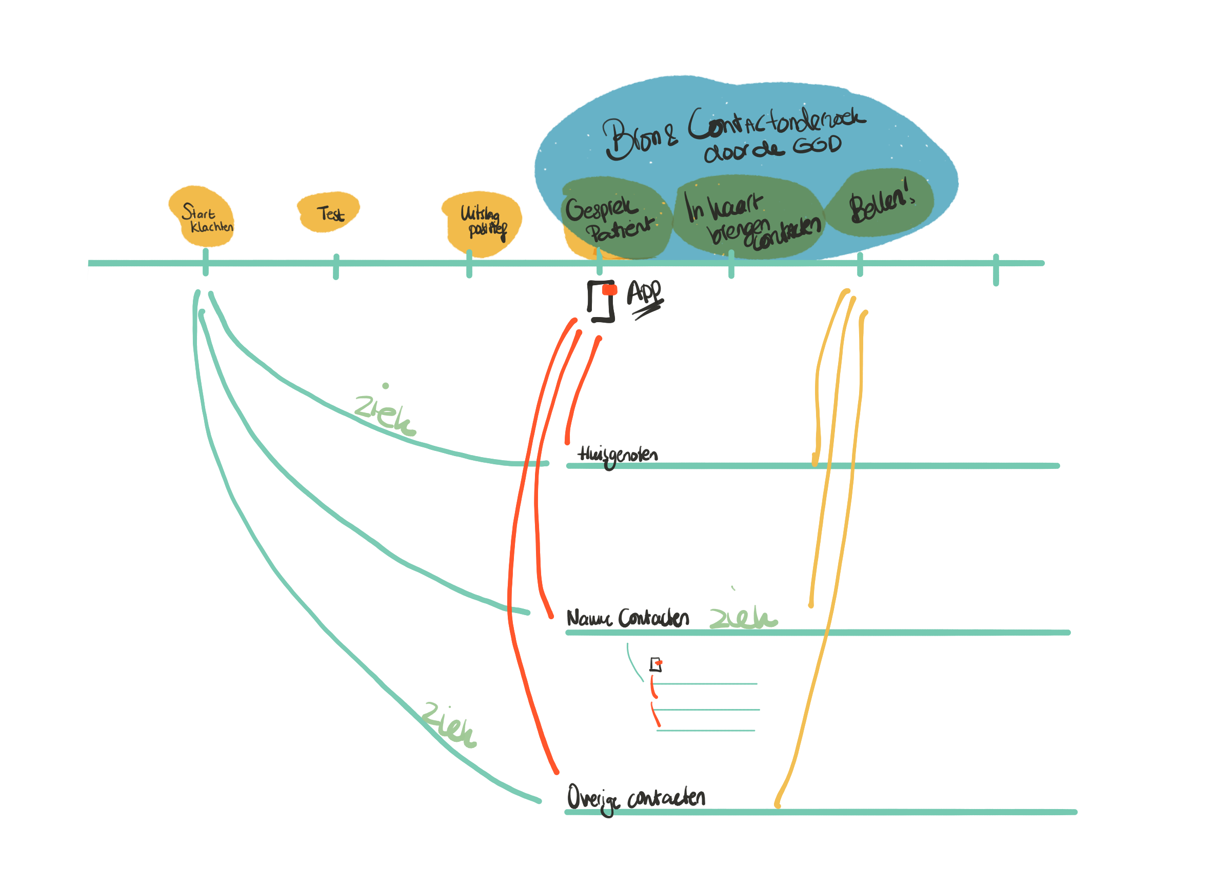
Many people who owe a debt to a government organization fail to pay it. A person can have all kinds of reasons for that. In the process of repayment, or the collection process as it is called on the government side, there are all kinds of steps. One of those steps is for the government to eventually seize your income. That is a major intervention.
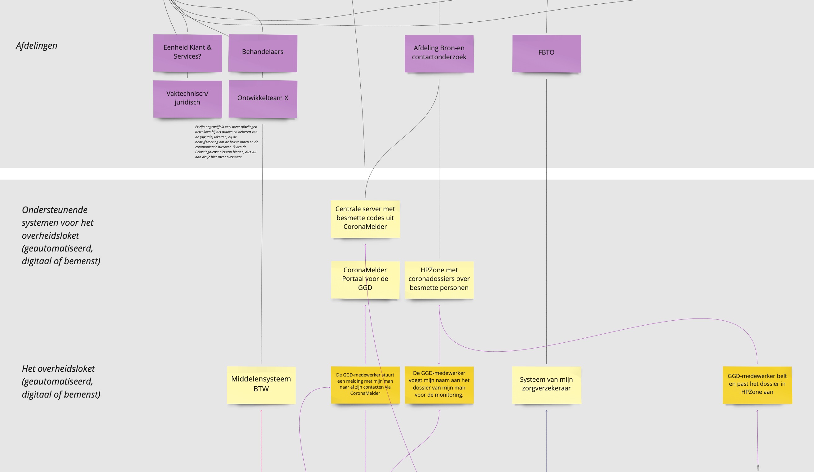
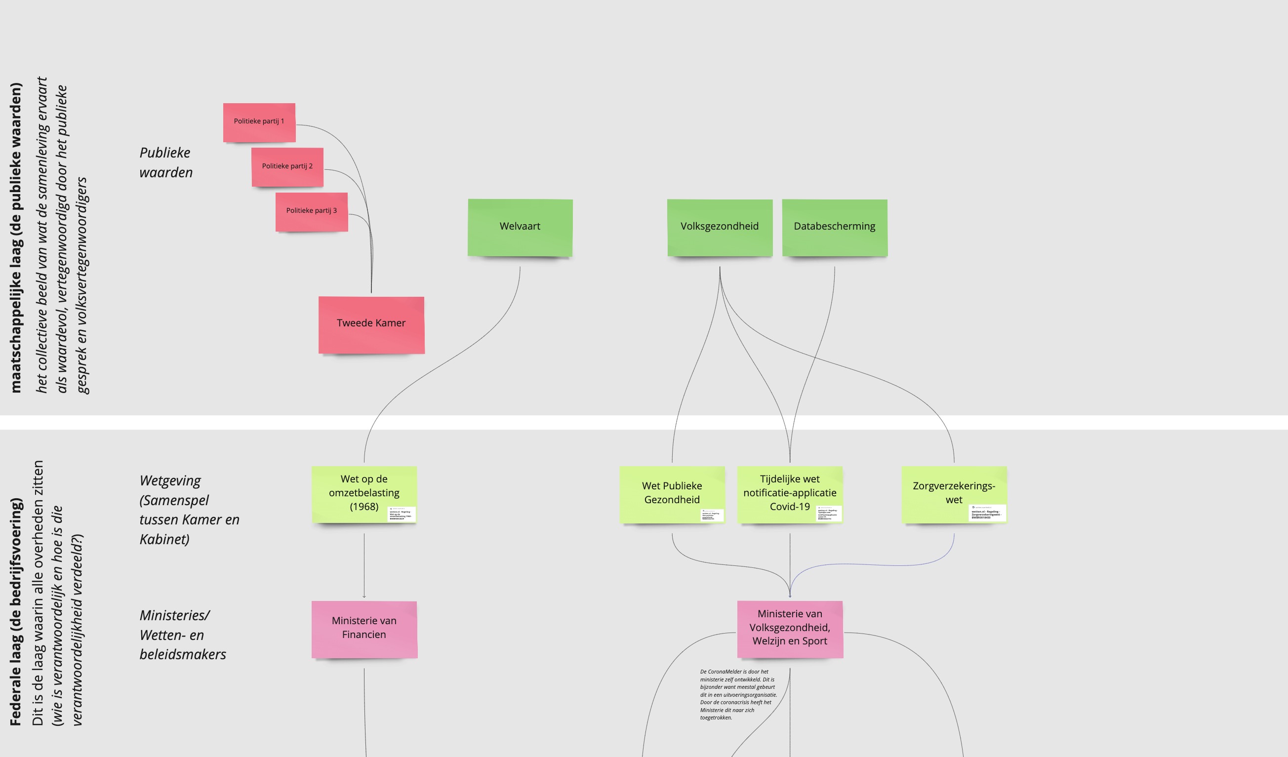
To protect citizens, the rule is that such a seizure must never cause you to fall below the subsistence level. Yet it happens. Indeed, the government is legion; different government organizations do not know from each other if and who has already seized. So it may happen that you do get pushed below the subsistence level because the government is competing with itself to collect a debt.

Solving this problem is proving to be very tough. There are all kinds of different parties involved that have different structures and interests. That’s partly how it was once set up and partly how it grew. Then there are all sorts of other rules that make it difficult to solve this problem, for example the rules about sharing citizens’ data between organizations. And the problem is also constantly changing. In recent years, we as a society have begun to think differently about debt. From “people don’t want to pay” to “people can’t always pay.
How do you look differently?
To understand and address such problems, Kees Dorst devised a series of steps he calls the reframing method.
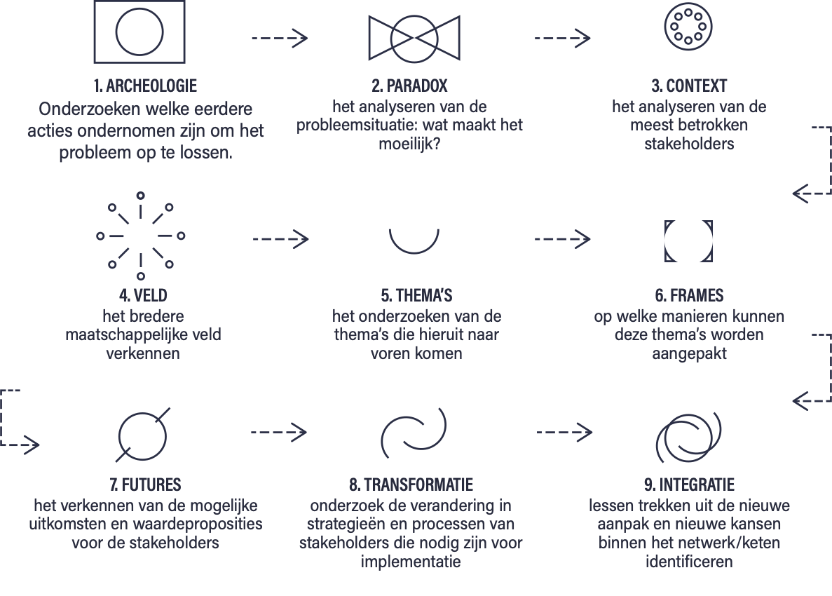
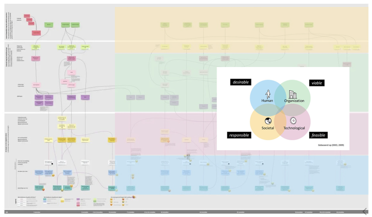
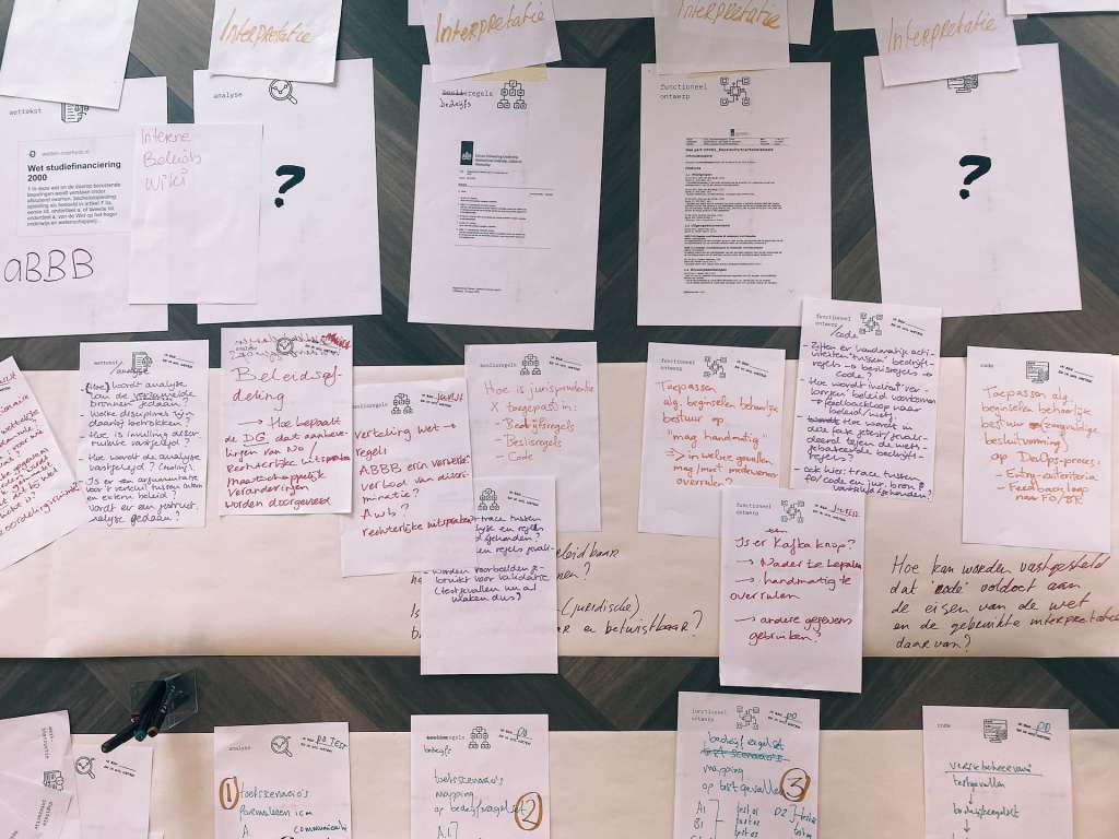
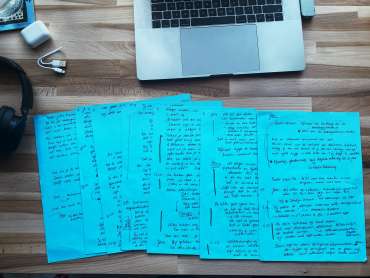
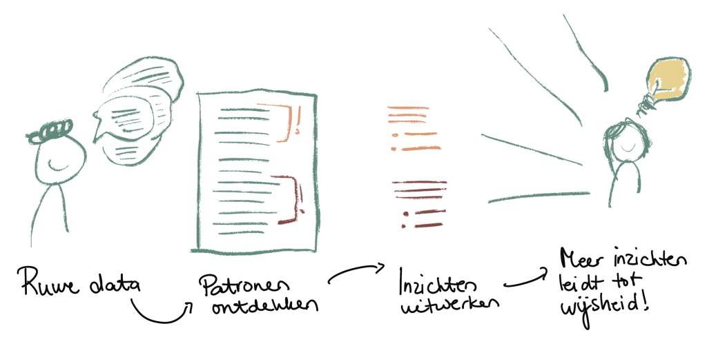
As a team, in the weeks leading up to the collaboration day, we put together as much as we could of what has been done so far to address this issue. To fully understand the problem, we tried to adress everything that makes it so difficult. Often then all sorts of paradoxes come along. Things that at first glance are a contradiction that makes something fail, but don’t have to contradict at all. We also studied the parties involved. What makes them so different, and where is overlap?
On the collaboration day, we set to work naming key themes and seeing if we could come up with some new frames. How might we look at the issue differently?
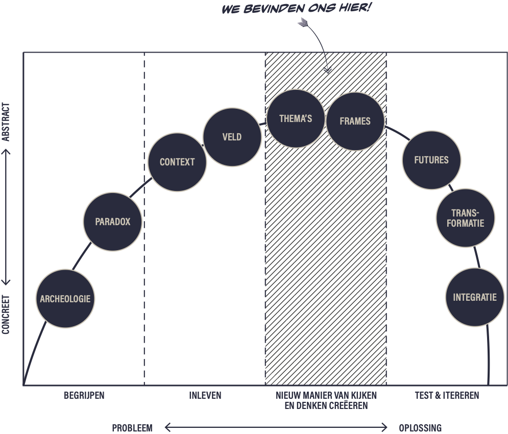
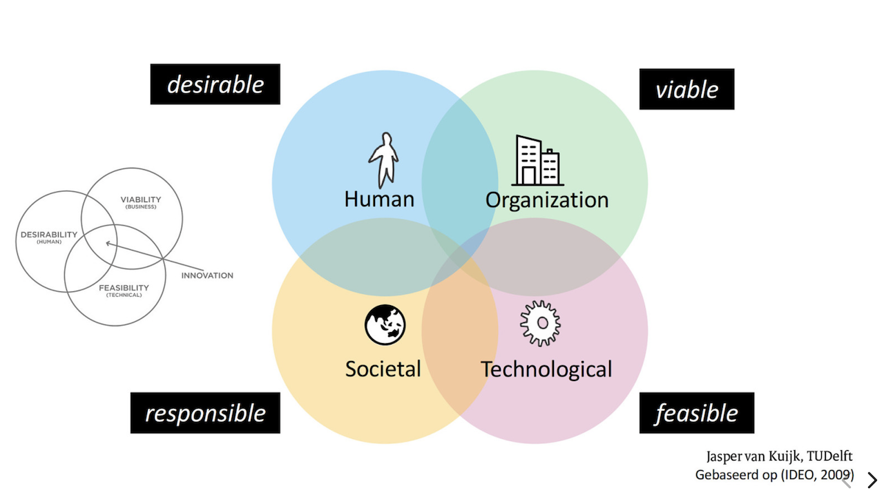
Coming up with a new frame like this is always quite a challenge. Once you get it, you think “yeah, makes sense. But just try to think of it. To do this, you must first understand the problem well and examine it from different angles. A good frame helps you to then be able to formulate a good design question. In turn, you can think of solution directions that you can work out.
An example. A paradox in solving this issue is that the people affected are not involved. We assume that they have so little doing power, after all, they can’t pay off their debts either, that they can’t participate in the solution either. Thus we exclude them of the process unfairly. A new insight is that for a good solution, we desperately need the lived experiences of this group. We need to understand much better how things that are conceived work out in practice.
A good frame then is: the experience expertise of people with debt is the key to understanding the issue. A design question that fits with this then is: how can we position these people so that they can contribute their expertise?
Structure of the day
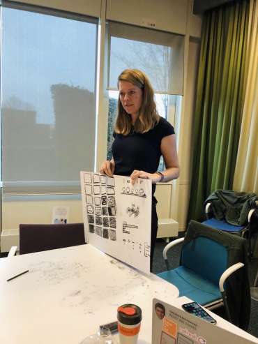
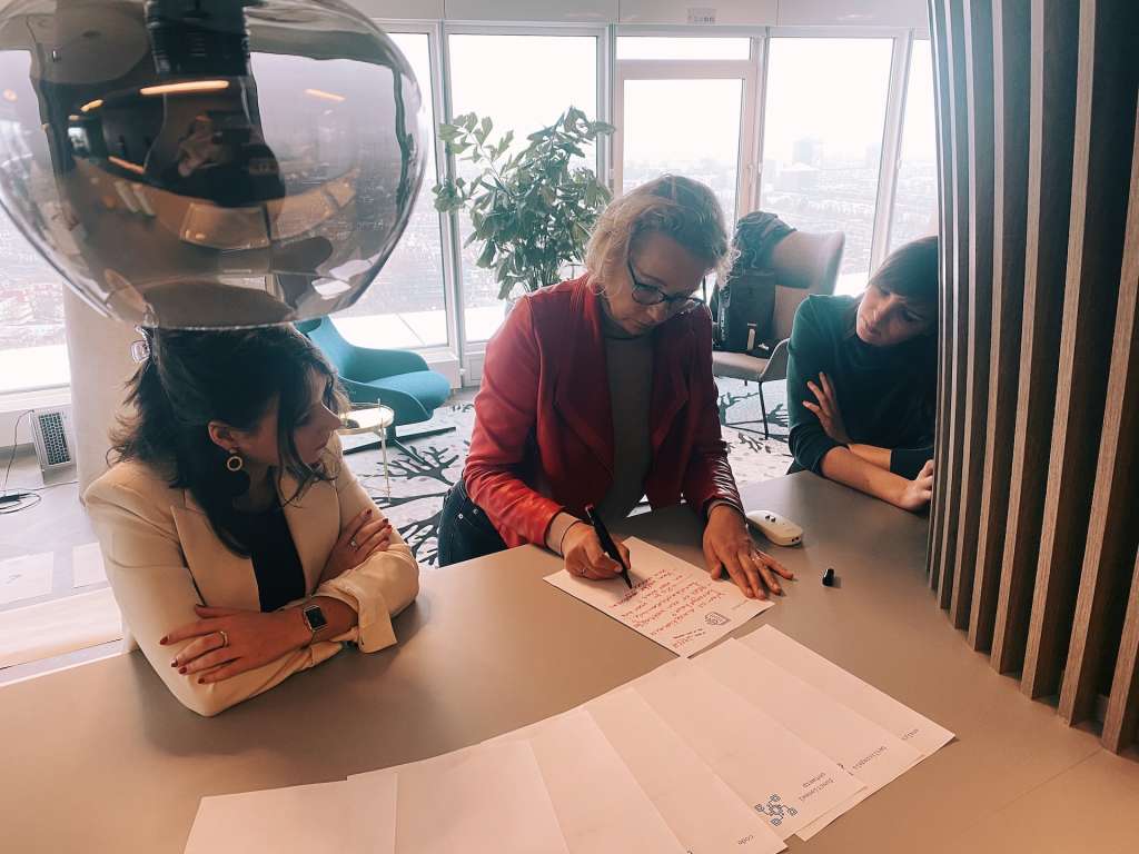
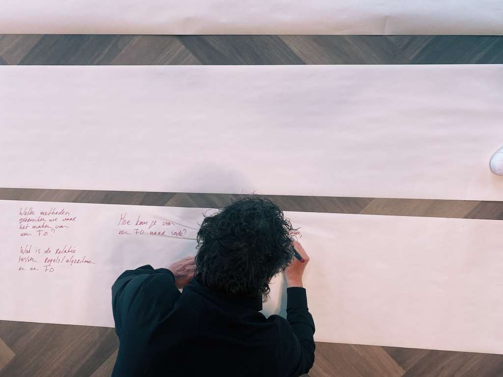
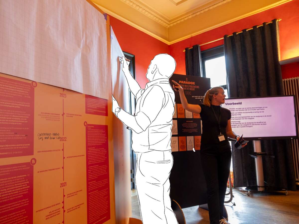
The collaboration day began with a rolling start. Throughout the room we had placed large signs on which the first steps of the method were visualized. Participants could add to them their own expertise. That content was the material we worked on for the rest of the day.
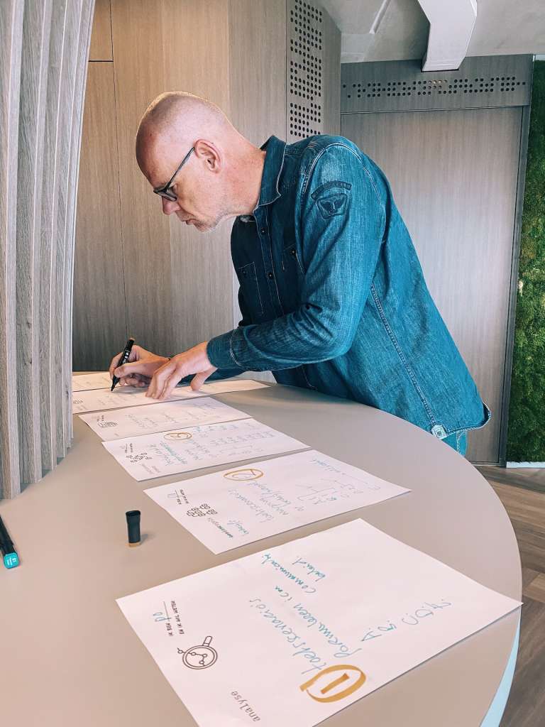
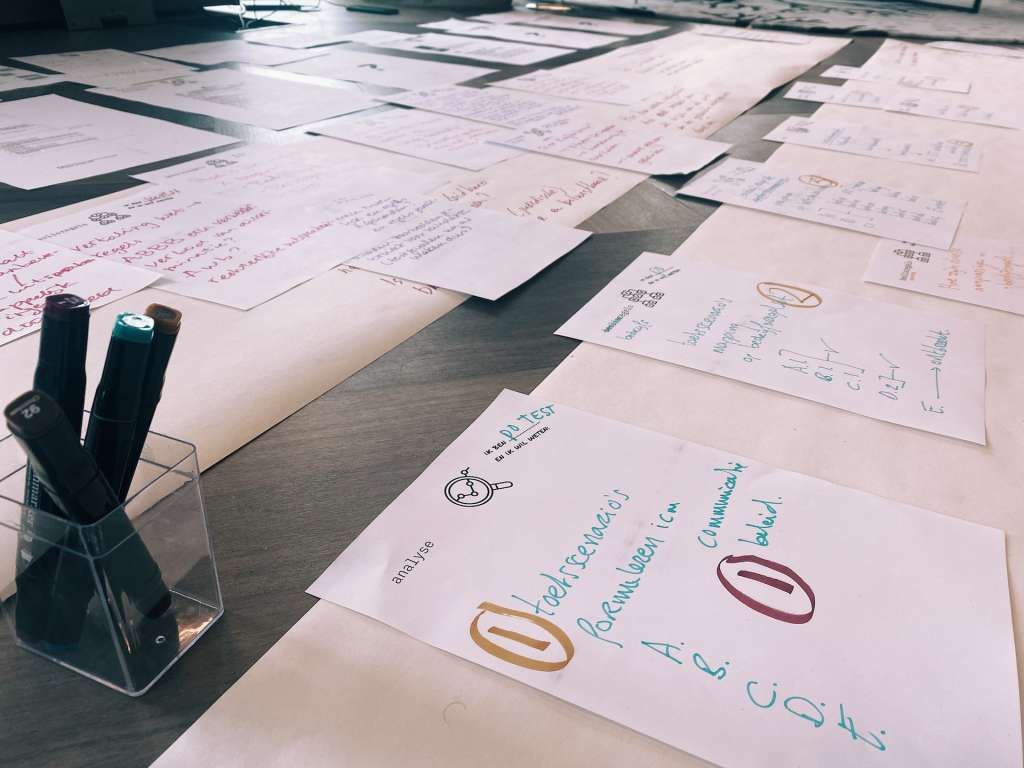
In the morning, each group engaged in a partial perspective. Are you looking through the perspective of the user, society, organization or technology? If you only look through that lens, what do you see? What makes it difficult and what opportunities do you see?
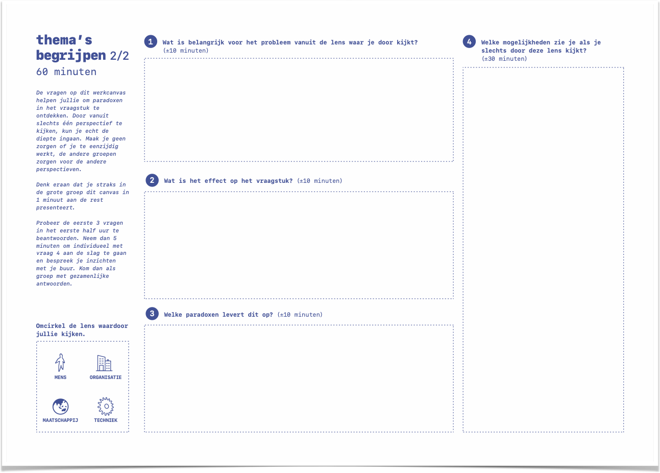
In the afternoon, we continued with those possibilities and came up with ideas to go with them. Again, we worked out those ideas in groups using a work canvas. This is what we will continue to do as a team in the coming weeks.
What can I learn from this for my research?
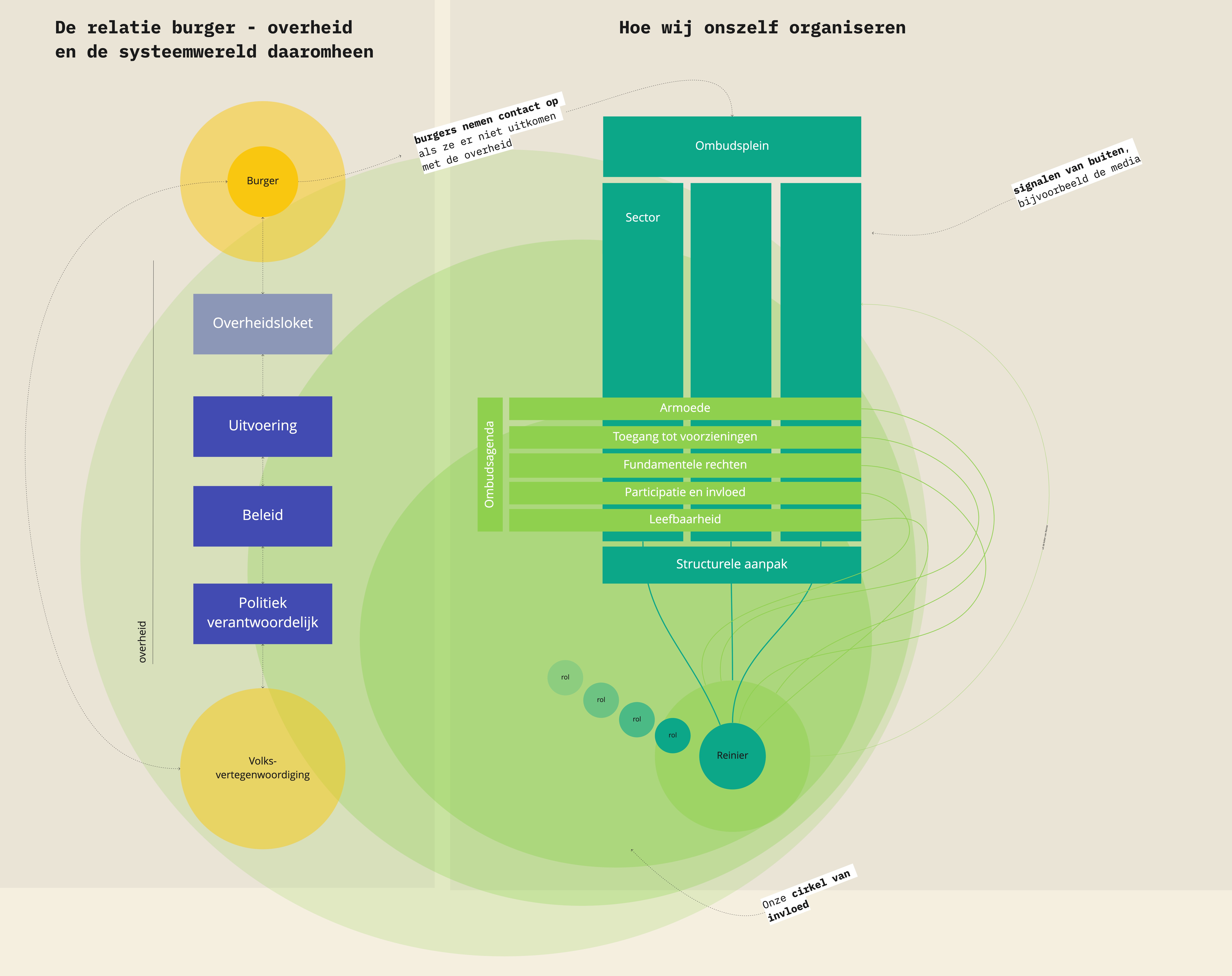
One of the participants came up with a wonderful quote. “We look through a straw, but with the citizen everything comes together.” Because government organizations are divided into all sorts of separate functions and teams, there are partitions between everything. There are few people who really have an overview of how things work and what the consequences are in practice. That is also what makes such an issue so complex. Where do you put the cut? Do you need to make the issue bigger? So big that it can’t be handled? But then again, many more people need to be involved, because each sub-issue has its own policy staff and product owners. At the same time, we have the luxury of cutting it up; someone in debt does not.
This paradox is not new to me. In previous studies, even before my doctoral research, I also encountered this often. I previously wrote an essay about it“Is there anyone with oversight?
On top of that, the pressure not to make mistakes is great in government. Failure is not an option because the consequences are dire. For individual citizens, and a social, political reckoning also follows. Yet we regularly fail precisely because we don’t get a shot at this kind of tough problems. This paradox leads to risk avoidance. Experimentation sometimes seems like a dirty word.
In government, you have to think big, but act small. This is a different approach than how government usually operates. The reframing method, and really any design method embraces precisely making, trying out and testing to practice with real people, and doing so as early and as often as possible.
How can you shape this in government? That is what we are going to work on in a small way, in this topic, in the coming time. And on a larger scale, what does this mean for applying design methods in government? Fortunately, I have a few more years to figure that out.
Want to read more?
- Dorst, K. (2015). Frame innovation: Create new thinking by design. MIT press.
- Schaminée, A. (2018). Designing with-in public organizations: Building bridges between public sector innovators and designers. Bis Publishers.
- I summarized the first results from my own research on design in government in this blog: Trusting the process is not enough.